Thursday, 14 January 2016

Trailer Analysis

Carrie 2013. We are referencing this particular trailer in preparation for creating our own because, the plot of the film is intertextual with ours. The film is about a girl who gets bullied at her school, and takes revenge upon her peers. Similarly our trailer has the story line of a character around the same age range, conducting revenge against his high school bullies who humiliated him. Another point being that the pace of the Carrie trailer is increase throughout the duration. This is the same process that we wish to achieve within our own trailer. The lighting in Carrie is low lit and ambient which creates the conventional horror film tone, and we want to have this in our trailer, so may adapt our lighting to meet this convention. The Final 2010. This trailer has a similar plot to our own. At the start it shows us why the protagonists commit the actions that they do (shows us them being bullied by people from their school). In our trailer you see the protagonist as a child and gives an explanation as to why he commits the murder that he does. The plot of The Final is based around getting revenge on the ‘popular’ group of people at high school, and this is roughly what happens to the protagonist in our film. The overall tone and atmosphere of the trailer is dark and tense, which is what we want to capture within our trailer. Black Christmas 2006. The main setting of this film is based around the Christmas holiday, and this is similar to when we want our film to be set. As well as the setting being similar to the trailer of Black Christmas, it has the same pace as what we want our trailer to be. The trailer starts of slow, but increases throughout before you get to the climax, which is what we want to achieve when creating our trailer. The music in this trailer is intertextual to the theme of the film, and is something we want to incorporate within our own trailer. We want our trailer to have low lit lighting in order to carry out a tense atmosphere, and this lighting is used within the Black Christmas trailer so we can intertextualise with this.

Friday, 23 October 2015

DISTINCT

Halloween Analysis

History of Horror

Empire Magazine Analysis

‘Empire’ is a well-known blockbuster movie magazine. Over the years it has reviewed and previewed some of the biggest movies to be released. As well as this it has interviewed and featured some of the biggest celebrities around. A USP (Unique Selling Point) of this issue of Empire magazine is the cover image. As it is a special about the Avengers: Age of Ultron film it features all of the main characters from the Avengers franchise. What makes this a USP is that it appeals to a large fan base, not only the fans of the Avengers films, but to fans of Marvel comics and Marvel films. The shot type used for this image is a low angle long shot. This type of show us used so that we can see all of the characters and their heroic poses. It also shows the power they have, we are looking up at them, and they have all the power and the powers. They are stood on top of some rocks which gives them the height advantage over us, which makes us even more inferior. In the background we can see what appears to be the enemy of the Avengers. Usually in action movies the heroes are outnumbered by the army of the villain, this appears to be the case in this image. There are a lot of black images in the back ground which appear to be people or robots, thought more likely robots as the main cover line states ‘More heroes! More action! More robots!’ The beings in the background being black could connote that they are evil. They are the complete opposite of the good characters, which are more colourful and are the focus of the cover in the main image. The red and white colour scheme of the writing on the cover adopt the colour scheme of the marvel logo, the red background and the white writing.

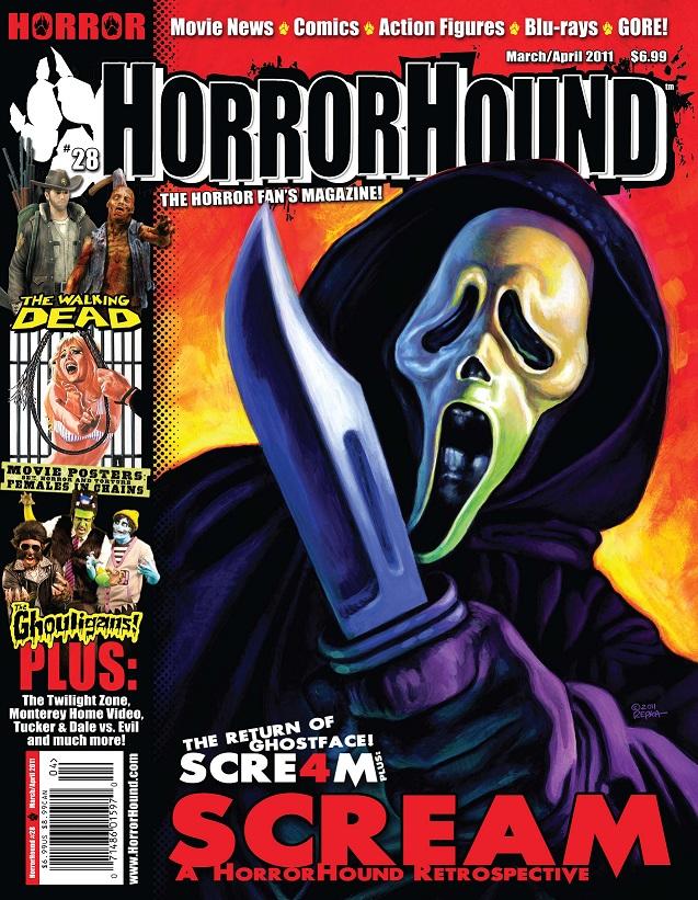
HorrorHound Magazine Analysis

HorrorHound is a film magazine that specialise in horror films, hence the name. The readership of HorrorHound varies. We know this from the cover because it contains an image of ‘Ghostface’ from the ‘Scream’ franchise which has been around since 1996 and one of the cover lines mentions ‘The Walking Dead’ which is a horror/drama tv show based in post zombie apocalypse USA. The Walking Dead first aired in 2010. It would mainly appeal to the same generation of fans as the ‘Scream’ Franchise, however, much of the fan base for The Walking Dead is of the current generation of youths, so it appeals to more than one audience. As mentioned before, the most prominent image (the main cover image) is of ‘Ghostface’ the protagonist from the ‘Scream’ Franchise. The use of Ghostface as this issues Unique Selling Point (USP) would attract the attention of the older generation of people that have been fans since the film was first released in 1996. The mask he is wearing and knife that he is wielding are icons of the ‘Scream’ franchise. The knife is also an icon of the ‘Slasher’ sub-genre of horror films. The use of a mid-shot in this image helps us to see the face of the killer and his/her weapon of choice, just as the victim would see them before they are killed. The flames behind the killer show the path of devastation that he/she leaves behind as they continue on their killing spree. The division of the magazine in to thirds is typical of most magazines. The main cover image is in the dominant two thirds of the magazine while the cover lines make up the final third. The use of the black strip is to divide the two so that the cover lines do not interfere with the main cover image, which will be the main article within the magazine. The black strip in the first third is also used to advertise what else is in the issue. The use of red and black on the cover of HorrorHound helps to define it further as a horror magazine. Red and black are typical colours of the horror genre, with red usually connoting blood and/or danger and black signifies the darkness of the deeds of the killer.

Fangoria Magazine Analysis

Fangoria is a film magazine that is distributed internationally from the US. It specialises in the genre of Horror. It has been in regular circulation since 1979. The readership largely varies due to the differing cover films on each issue from different generations. Some may appeal to the young generations, films such as Zombieland (2009) and Shaun of the Dead (2004). Whereas some may appeal to older generations, for example the Original Halloween (1978). The cover image on this issue is titled “Rob Zombie’s H2”. This is the second film in the Rob Zombie remakes of the “Halloween” franchise (Originally directed by John Carpenter). The supporting article titles are also of films released in the same year as H2 (Halloween 2, 2009). The first thing we see is the prominent image of Michael Myers, the psychotic protagonist from the ‘Halloween’ series. We know that it is Myers by the iconic mask and boiler suit combination we see in the image. This image is a great Unique Selling Point (USP) as fans of both the original Halloween series and the Rob Zombie remakes would want to buy it to read about the “Exclusive set visit!” and the editors of the magazine went on. The use of “exclusive” would also appeal to the reader because they know that they are not likely to find out this information for any other magazine. This issue of Fangoria would likely appeal to the new and old fans of the series. The use of high key lighting helps reveal the state of Myers either during the second film are after the events of the first. It highlights the condition he is in, his overalls are blood soaked and his mask is torn, this is likely due to the confrontation he has had with his most recent victim, it appears they have put up a bit of a fight.

Wednesday, 21 October 2015

Friday the 13th Poster Analysis

Friday the 13th is a horror movie released on the 13th February 2009 in the United States of America. The main cover image is of the killer in “Friday The 13th”, Jason Voorhees. The iconography from this poster is the mask on Jason’s face. This hockey mask is the mask worn by Jason in all of the Friday the 13th films and also the spin-off movie, Freddy vs. Jason. Another piece of iconography is the machete that Jason Voorhees is wielding. Ever since the first Friday the 13th Jason Voorhees went from the vision of a disabled young boy, to a non-verbal, indestructible, machete-wielding mass murderer. Yet again the mask worn by Jason is a deformation and also does hide a greater deformity, typical of all killers in horror movies. Friday the 13th falls into the sub-genre of horror films known as ‘Slashers’. Friday the 13th, like many Slasher films is based around a calendar date, obviously in this case its Friday the 13th, which many people see as bad luck. Bad luck is exactly what people must have if they came across Jason Voorhees when he is ready to strike The main colours on this poster are as expected, black and red. Yet again the black is used to connote the darkness of the deeds committed. As well as the black representing darkness it also represents/connote the night time in which most of the film is based in, similar to many horror films, but as mentioned previously, not all. The red could be a link or a connotation of blood. As well as this it could be a connotation of danger. Beware of “Friday The 13th”. This is because Friday the 13th is universally known as a bad day. Usually a lot of bad and unlucky things happen on this day (as mentioned before). The bit of white that we can see in this poster is used to connote the light of the moon shining through the darkness of night. However it is still the darkness that is the most dominant. Like in the Friday The 13th Film. The tagline on this poster is simple. “WELCOME TO CRYSTAL LAKE” is simply a reference to the name of the area/lake in America that the movie is based around. There is a camp nearby. Typical of the horror genre the area where the victims will be killed it rather secluded, it is set in a forest/woodland area.

Thursday, 15 October 2015

Scream Movie Poster Analysis


First released in 1996 “Scream” is a crime, mystery, horror movie that was first released in the United States of America. The main cover image is of the iconic “Scream” mask worn by the killer in each of the Scream films, of which there are 4. The main image can also be seen as a dagger. This is the weapon of choice for the killer. In this image, we don’t see much of the killer, whereas we do in other movie posters, for example “The Texas Chainsaw Massacre” movie poster (Which can be seen in a previous post). However, the combination of the mask and black background could signify the whole killer. His costume is all-black and he wears this deformed mask. The deformation is typical of a horror movie killer. As notable, black, red and white are the three main colours on this magazine. The white is used simply on the mask, which in all of the Scream films is white. White also connotes purity. Purity, however, is not common in horror films, especially for the victims. Most victims are sex, alcohol and drug addicts, which is usually the killer’s primal reason for dispatching of them. It is also what makes it so easy for the killer to killer his/her victims, they are distracted with sex, drugs and/or alcohol, making it much easier for the killer to get to the and kill them. The white could symbolise the purity on the survivor, usually female and known as the ‘Final Girl’ she is more often than not virginal. Unlike her friends, the victims, she is a virgin, isn’t distracted by sex and is aware of the danger posed by the killer. The red, as evident, symbolises blood. Red is the colour that is linked with blood. The blood that is dripping off of the tip of the knife is obviously that of one of the killer’s victims. The black connotes darkness. It symbolises the killer’s cloak, in which he wears throughout the film. It could also connote the darkness of events that happen within the film. Furthermore many of the killers are performed at night time. The tagline on the poster “WHATS YOUR FAVOURITE SCARY MOVIE?” this is a link to a question that the killer asks Drew Barrymore’s during their phone call before he kills her boyfriend and ultimately kills her off, very early on in the film.

Texas Chainsaw Massacre Poster Analysis

The original Texas Chainsaw Massacre movie was first released on 1st October 1974 in the USA, it spawned many sequels and was then later remastered and re-released, the most recent release being 2013, which was also in 3D. The Texas Chainsaw Massacre is mainly of Horror genre but also fits into the Crime and Drama genre. It also falls in to the sub-genre of Slasher film. The main image of this poster for the Texas Chainsaw Massacre is of the killer himself, wielding his trademark chainsaw weapon. As he is the most dominate character in the film he dominates the poster(s) as well. Typically in horror movies the killer is usually deformed, this again in the case of the killer. The Killer, known as ‘Leatherface’ wears a mask which is fashioned out of the skin of the victims he kills, and he and his family eat. This shows the deformity of this killer, but under the mask, he is equally deformed. His whole family are inbred, which leads to his facial deformity, which he hides under his mask. The mask and chainsaw are the most iconic images of ‘Leatherface’ the killer from the Texas Chainsaw Massacre franchise. The main and most dominant colours are red and black. The black could connote the darkness of the events of the film; also a fair chunk of the film is set in the night time, so the darkness there could be the connotation for this. This is typical of the horror genre, many horror films are set in the night time, so that the killer can move much more freely than in the day, when there are lots of people about. However, this is not always the case, some horror movies are set in the daytime. For example parts of some of the ‘Wrong Turn’ films are set in the day time. The red on the poster and on the chainsaw obviously connotes the red of blood. Which is very fitting seeing as this is based on a “Massacre” where a lot of blood is likely to be shed, regardless of the weapon. Red is also a typical colour within the horror genre, usually because there are major casualties in horror movies. Besides the red connoting blood it could also but used to connote danger. If you saw a rather large man running at you with a bloodied chainsaw you’d likely see the danger in this and would want to run. The tagline on this poster is “THE SAW IS THE LAW” this is very fitting because this small area they live in is basically lawless, even more so when Leatherface kills the only police officer around and his father takes charge as the only officer in the area. The only law of this land is the saw. If Leatherface or more so his saw believes you should be sentenced to death, he will find you and he will kill you.